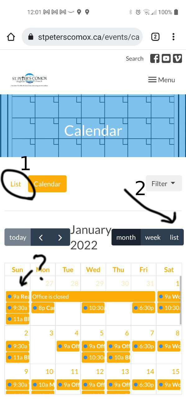
Reading our website calendar on a small screen can be challenging. By default you won't see enough detail to know what you're looking at. Here's a way to make it better. In the first photo you will notice that the question mark arrow points to the default view which is not very helpful. Note the figures 1 and 2, each showing a button called "list".

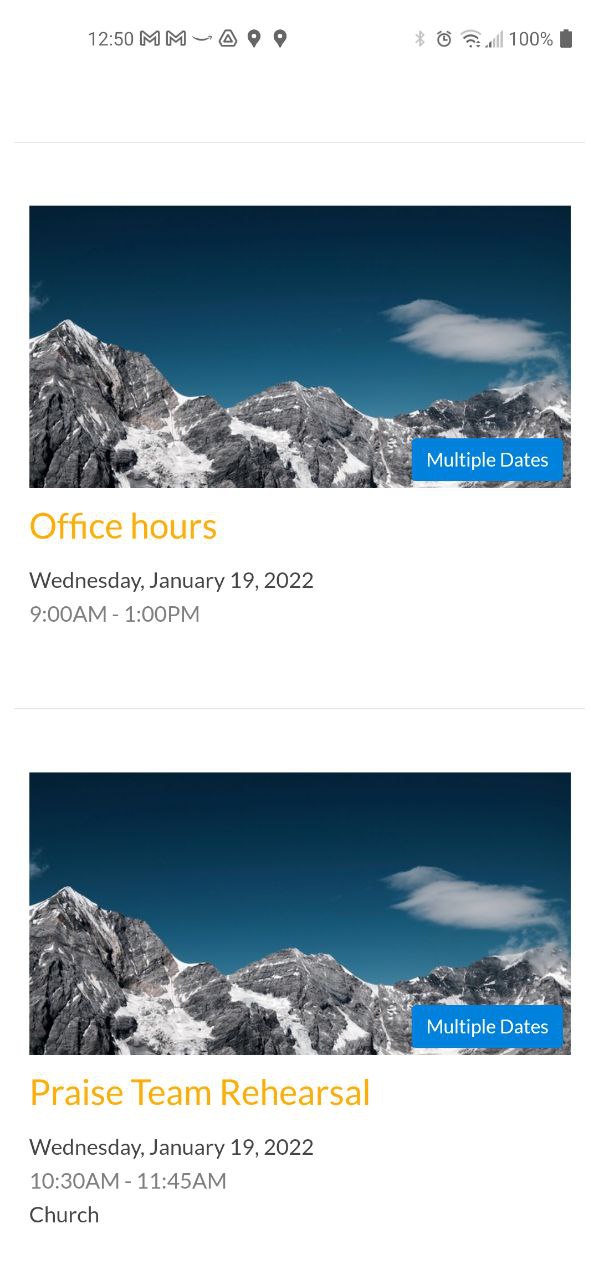
The #1 list button will show the calendar as a series of events that you can scroll through, with picture icons (as in the picture immediately below). It gives a little more detail at the expense of showing fewer events on one screen.

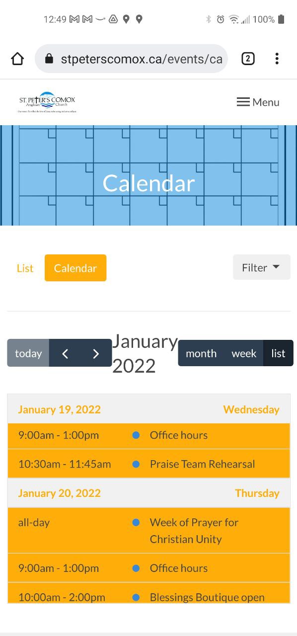
The #2 "list" button may not be immediately visible - if it isn't, scroll a little to the left to reveal it. Using this list view will create a compact listing that can easily be scrolled through, with no picture icons (as in the picture below).
 Still need help? Call the office for some friendly tech advice!